Living Large in a Small Space: a Before-and-After Peek at GFF Magazine’s New Headquarters

After four years of creating GFF Magazine out of my spacious suburban Marin County residence, I succumbed to my itch to move back to my hometown of San Francisco this past spring. My inspiration was part timing and part circumstance; a seller’s market aligned perfectly with a kitchen leak that forced a displacing remodel.
Since I decided to move before I secured a new place to live, I was not prepared for how much I would need to downsize. But when I found the perfect home, a 1906 “earthquake shack” that was less than half the size of my previous home but fit my budget and featured my only requirements—a sweet neighborhood, great kitchen, two bedrooms, a yard, and a cat-friendly landlord—I took the place on the spot. I then went through the painful but incredibly freeing process of saying goodbye to most of my belongings.
What they say is true—moving is one of the most stressful of life’s experiences, especially when your new home doesn’t have room for even your dining table or your L-section couch, never mind the contents of your two-car garage loaded with all the relics from your childhood, your child’s childhood, and both of your parents’ estates. But the hundreds of hours of sifting through documents, drawings, photos, toys, kitchen gear, and clothing had multiple benefits; it ushered me through a bittersweet retrospective of my life, forced me to make room for new memories, and inspired me to get creative on how to make my new small space deliver big on comfort, usability, and hospitality.
My most important lessons? Less really is more. I now have only what I need and what I truly love and use. And, you can have your cats and nice furniture, too—if you invest in a little makeshift-scratching-post prevention (more on that below)!
I’m excited to share a peek at my sweet little abode, which Room & Board kindly partnered with us on to help furnish. It’s where we create GFF Magazine and where I live happily, especially now that I’ve figured out how to fit 10 people for a sit-down dinner in my eat-in kitchen (hint: it requires ditching the round top and using two fold-out tables).
BEFORE

The couch and table came with the house; they made good use of the space and the couch swallowed you up (in a good way), so I kept them until I found just the right replacements.

The kitchen has the only dining area in my house; turns out I like the cozy built-in–and, as I mentioned, I use two folding tables to expand it during larger dinner parties. The space is surprisingly accommodating.
AFTER

My vintage chair (where Mama is lounging) and side table are now joined by a new sectional couch and coffee table from Room & Board. I do a lot of my writing on the couch, so I appreciate its structure, which gives my back support while I sit upright but also welcomes sprawling for nighttime TV. Because the couch is on legs, it creates an airier feeling, as does the coffee table, thanks to its rounded edges and glass top. I invested in special double-sided tape to temporarily put on the corners of my couch to prevent my cats from thinking they are new, luxury scratching posts. 🙂

Photo Nader Khouri
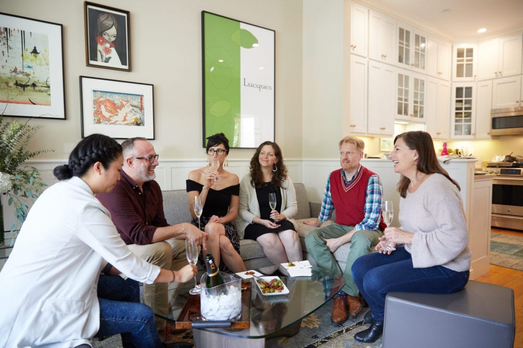
Doesn’t it look welcoming? Here you can see the space can easily handle a crowd of GFF contributors (left to right: Erin Ng, Eric Lundy, Emma K. Morris, Alanna Taylor-Tobin, and Eric’s husband Barry Lipscomb, and me–this was for our holiday dinner party shoot in our Holiday 2018 issue). I’m sitting on a leather ottoman also from Room & Board. I have two of them that I pull out when I need extra seating; when I don’t, they are pushed together as a comfy bench against a wall, but also make a great extra coffee table or surface for GFF Instagram posts.

You have no idea how many shoots for GFF happen in this little space. This shoot, with amazing Aubrie Pick behind the camera, is a phenomenal brunch for the January 2019 issue of GFF. (And yes, we really eat every last morsel of everything we shoot!)

I hate the way TVs look, so I only have a small one. Plus, the Room & Board media cabinet it sits on and the art above it (a gift from my dad) are so pretty, I hope the TV is barely noticed.

For photo shoots, we use every available surface, depending on the look we’re after. Here, GFF recipe developer Eric Lundy styles a brunch buffet for photographer Aubrie Pick to shoot.

Photo Nader Khour
In the kitchen, the linen tablecloth by Rough Linen elevates the environs and is durable–thank goodness, because we’re messy eaters! The silver is my mom’s, and the matte white plates are from CB2; they’re good for shooting food because they’re less reflective. If you live in San Francisco and need flowers, I strongly recommend Laurel Designs; she’s my go-to for every occasion.

Photo Nader Khouri
Of course no matter the size of your kitchen, it’s where everyone hangs out at a party, so I always prep as much in advance as possible so I don’t get irritated trying to sidestep everyone having a good time while I get the food on the table.

Photo Nader Khouri
No matter what, everything seems to work out around the dinner table.

Thanks for joining the tour of my and GFF’s new home. I hope you like it as much as Pearl does.
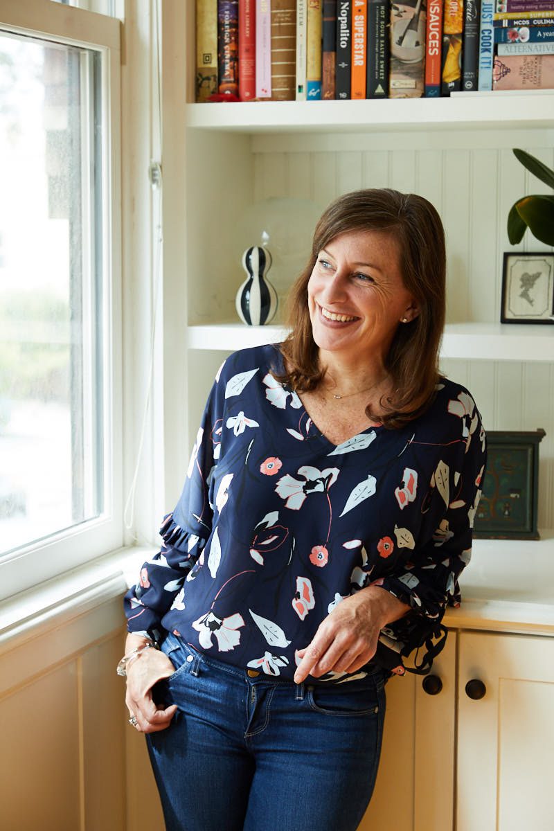
Opening photo of Erika Lenkert by Aubrie Pick
NOTE: We only recommend products that we truly LOVE, use, and are confident to recommend. Thanks to affiliate partnership opportunities, we sometimes earn a small commission if you make a purchase through a product link on our site at no cost to you. But this has no influence on what we recommend. When we do score a few shekels, know that your purchase helps support our work to bring you trustworthy, unbiased information on an amazing gluten-free food and lifestyle.

